
Technical analysis, indicators, and chart patterns; they all seem daunting when you’re at the start of your journey. If you’re new to trading and are grappling with this “problem”, this mini-blog series is for you. Part I introduces you to chart types, the anatomy of a candlestick, and chart patterns. Let’s dive in!
Deep dive into technical analysis
Technical Analysis is a type of financial analysis that uses chart patterns to identify trends and predict future short-, mid-, and long-term price movements. To do this, it uses a variety of technical indicators and chart types, as described below.
Lines, bars and candlesticks
Charts and basic technical analysis principles are as old as time. Candlesticks emerged in the 18th century. The “design” of candlestick chart patterns was attributed to a Japanese rice trader named Munehisa Homma, who used them for the first time.
The early version of Japanese candlestick charts differs from the one introduced later in the US, but many of the principles were similar to the ones we use today.
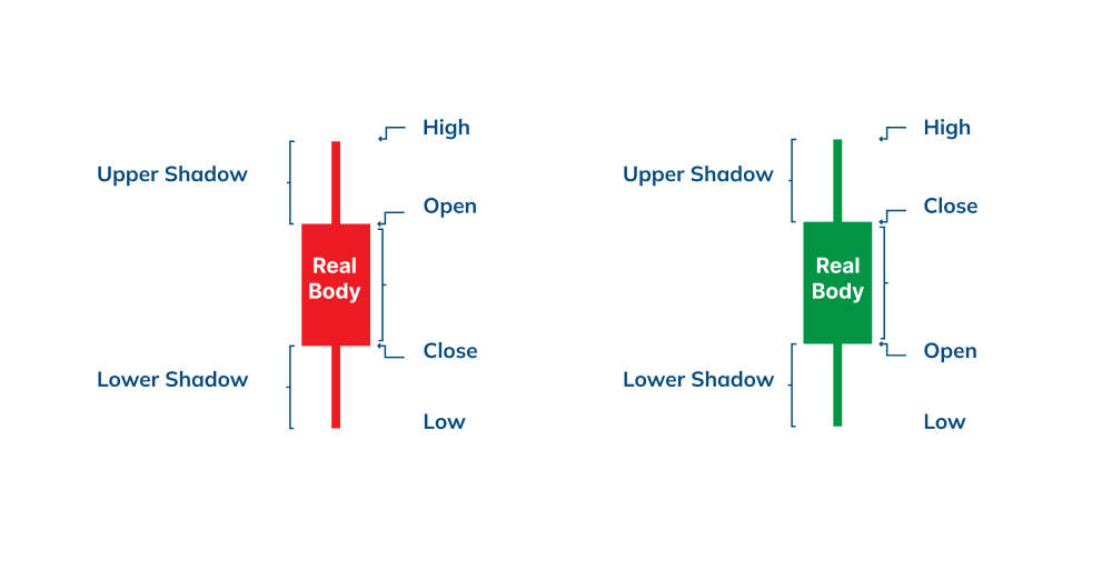
A candlestick shows an asset’s high, low, opening, and closing price levels for a pre-set period. This period can range from 4 hours to a day, or a year even.
We can also see if the markets move up (bullish) or down (bearish). Traders can analyze different patterns and formations to predict future asset movements.
Candlestick anatomy
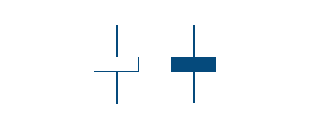
Candlesticks usually comprise a body, an upper, and a lower shadow. Generally, bullish candles are green, while bearish candles are red.
Typically, the upper shadow indicates the highest price level, while the lower shadow points to the lowest price levels that an asset could reach within the represented timeframe.
The body shows the opening and the closing prices. The longer the body, the greater the price movement. A shot body indicates little movement. Let’s take a closer look at a candle!
Line charts
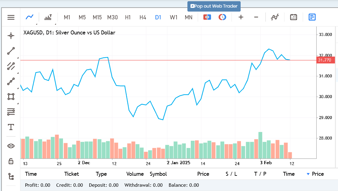
Line charts are the most basic type of charts used in technical analysis and typically show only closing prices over time.
Line charts can be used on any timeframe, but most frequently with day-to-day price changes, as shown below.
Bar charts
Bar charts show the opening, the high, low, and closing prices of an asset over time. The vertical line on a price bar indicates the high and the low prices for the period. Conversely, the left and the horizontal lines show the opening and the closing prices.
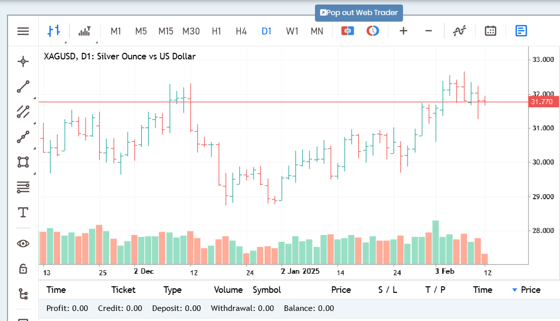
OHLC = Open – High – Low – Close
Chart patterns and indicators
Let’s have a look at some simple chart formations.
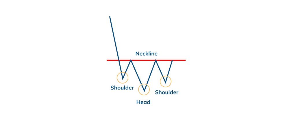
Head and Shoulders
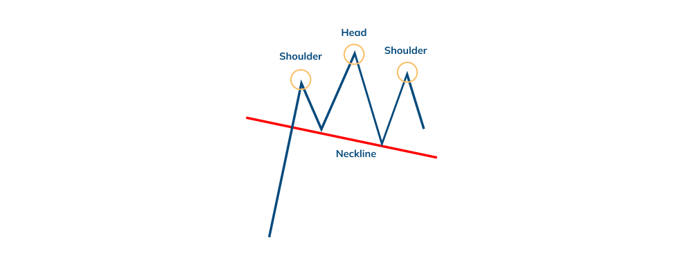
The Head and Shoulders pattern is a trend reversal formation. As its name suggests, it consists of three peaks: the first peak (shoulder), a higher peak (head), and a lower peak (shoulder). Traders draw a so-called “neckline” by connected the lowest points and the two troughs. This could be a signal to go short (sell).
Inverse Head and Shoulders
The Inverse Head and Shoulders pattern is an upside-down Head and Shoulders formation. This could be a signal to go long (buy).
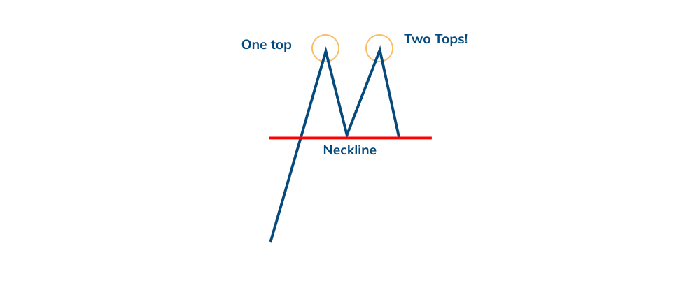
Double Top
The Double Top is a reversal pattern which forms after an extended upward movement. The “tops” are peaks and are formed when a certain price level is reached. As a rule, this price level can’t be easily broken. When this happens, the price will bounce off slightly but returns to test that level again afterward. If the price bounces off this level again, we have a Double Top. Usually, this is an indication to sell.
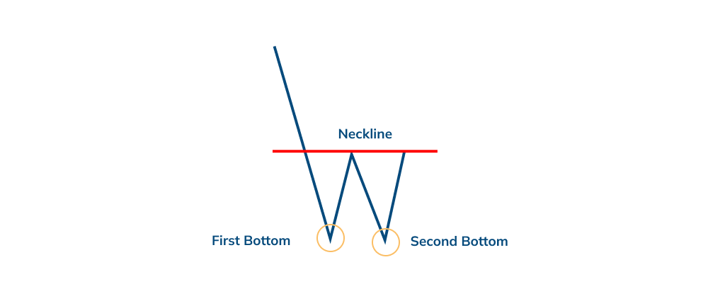
Double Bottom
The Double Bottom occurs after an extended downtrend and is the opposite of the Double Top. It could be a buying signal.
Gaps
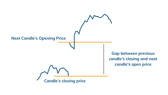
Gaps are perhaps the most spectacular chart patterns described so far, as they indicate clear price jumps or dips. They occur when more than pure technical factors are at play.
For example, if a company’s earnings came in higher than expected, the stock might gap the next day, meaning that the price will open higher than expected, as shown below.
Spinning Top: Neutral
The Spinning Top is a sign of indecision between buyers and sellers. These are candlesticks with long upper and lower shadows (wicks) and small bodies.
A Spinning Top during an uptrend usually means that there aren’t many buyers in the market, and a reversal could occur.
Conversely, the occurrence of a Spinning Top during a downtrend means that there aren’t any sellers out there, and a change in trend direction could occur.
The Hammer: Bullish
The Hammer is a bullish reversal pattern and takes shape during a downtrend. It signals that the bottom is near; hence the price could start rising again. The long shadow indicates that sellers pushed the prices lower, but buyers managed to overcome this selling pressure and closed positions near the opening price.
The long shadow is about two or three times the size of the body, with little to no upper shadow. The body is at the upper end.

The Hanging Man: Bearish
The Hanging Man is a bearish reversal pattern and forms during an uptrend. This formation can also be indicative of a top or resistance level. It can indicate when the price is rising, meaning that sellers are outnumbering buyers.
The long shadow indicates that the sellers pushed the prices lower during the session, but the buyers could push it back up, however, only near the open, telling us that there are no more buyers to push the price higher.
Trends
The concept of “trend” is the most important in technical analysis, as it indicates the direction in which an asset’s price moves.
Technical Analysts believe that the price movement tends to follow the trend. Therefore, future price movements are more likely to follow the trend and not vice-versa.
Trend types include:
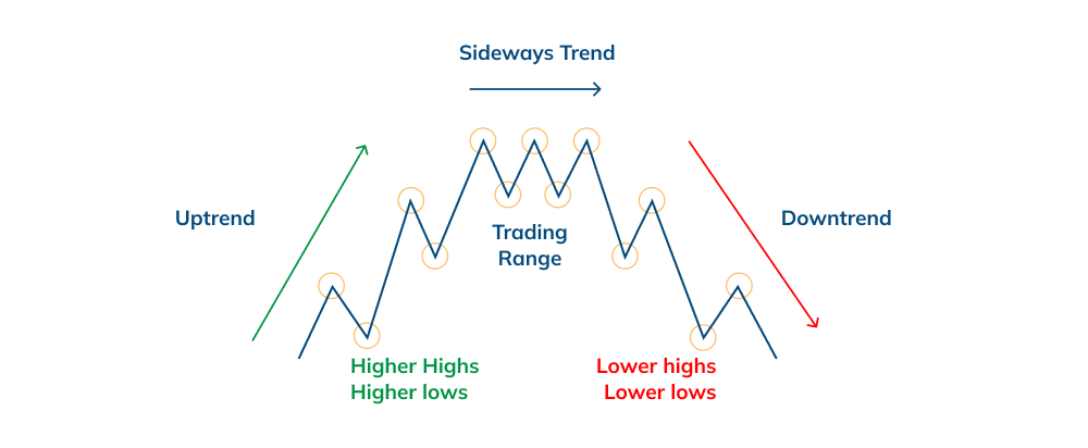
- Uptrend
- Downtrend
- Sideways/Horizontal/Range
Uptrend
An uptrend consists of higher highs and higher lows. The uptrend is the hallmark of a bullish market.
Downtrend
A downtrend consists of lower highs and lower lows. The downtrend is the hallmark of a bearish market.
Sideways/Horizontal/Range
This trend appears when there is little to no market movement. Some traders don’t even consider this sideways movement to be a trend but rather a lack of well-defined direction. It is usually associated with trendless markets.
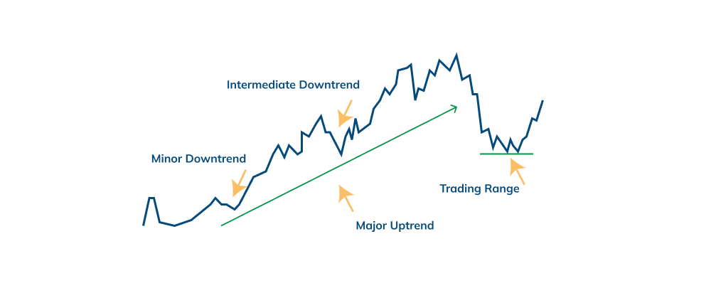
Among these trends, we can also distinguish between long-term, intermediate, and short-term trends.
Long-term trends are significant trends and can last for more than a year.
Intermediate or secondary trends can last between a couple of days and three weeks.
Short-term trends last for less than three weeks.
Reversal
A reversal is a change in the direction of an asset’s price. For example, when an uptrend reverses into a downtrend and vice-versa.
Breakout
Breakouts occur when the price slashes through support or resistance.
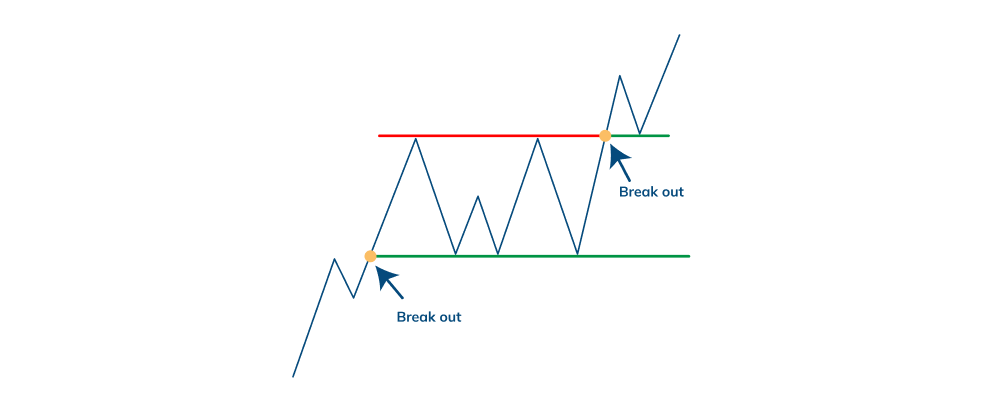
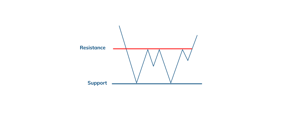
Support & Resistance
Support and resistance are critical concepts in technical analysis. While they are not exact numbers, they represent price barriers that are difficult to break.
Support levels prevent the price from falling below, while resistance levels prevent the price from climbing higher.
Eager to learn more? Stay tuned for Part II coming up next, and trade responsibly!
Risk Disclaimer:
CFDs are complex instruments and come with a high risk of losing money rapidly due to leverage. You should consider whether you understand how CFDs work and whether you can afford to take the high risk of losing your money. Prices can fluctuate rapidly, and past performance is not indicative of future results. Please refer to the full risk disclaimer on our website.
The information provided does not constitute financial advice and should not be relied upon as such. You should seek independent advice before making any investment decision.